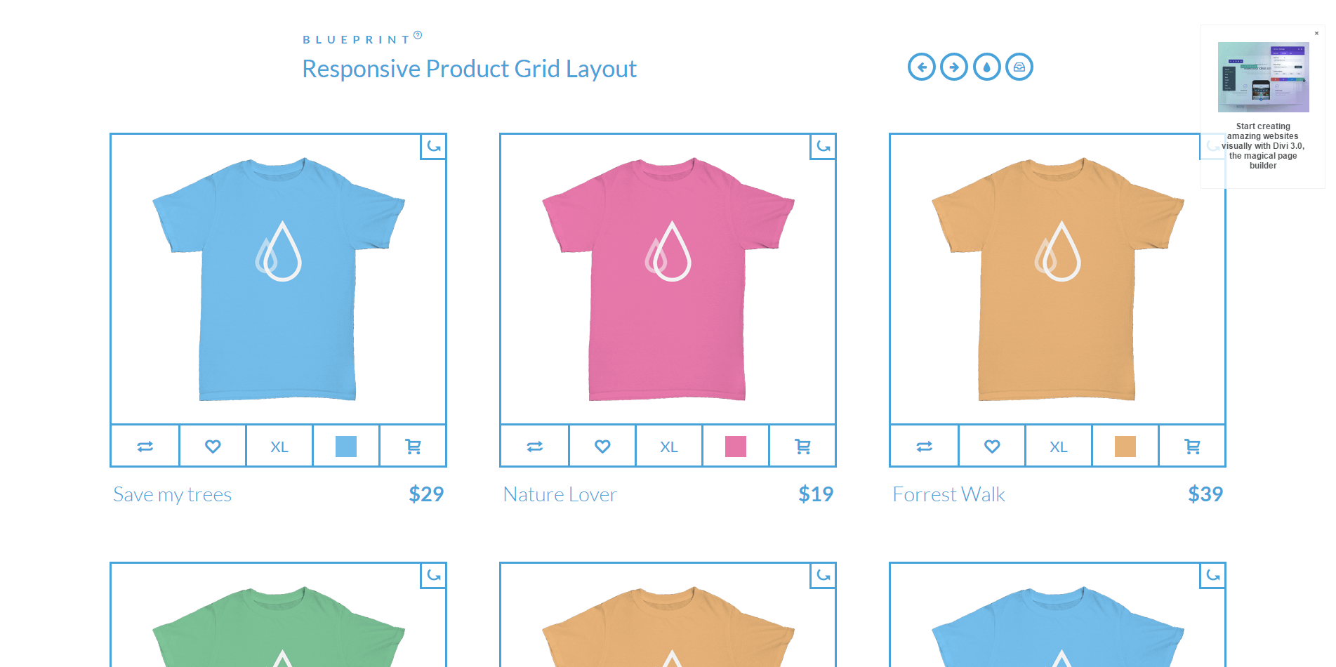
A responsive product grid layout that comes with some UI details for inspiration. The product will rotate showing the backside of the item when the rotate button is clicked. Some examples of how tooltips can appear on hover or click are also included. Media queries can be used to resize the items in the grid or change the number of items in a row. Flexbox is used when supported.
响应式产品网格布局,带有一些UI细节以获得灵感。当单击“旋转”按钮时,该产品将旋转显示该项目的背面。一些例子提示可以出现在悬停或点击也包括在内。媒体查询可用于调整网格中的项大小或更改行中的项数。flexbox时使用的支持。
UI细节产品网格布局-Product Grid Layout
人已打赏