
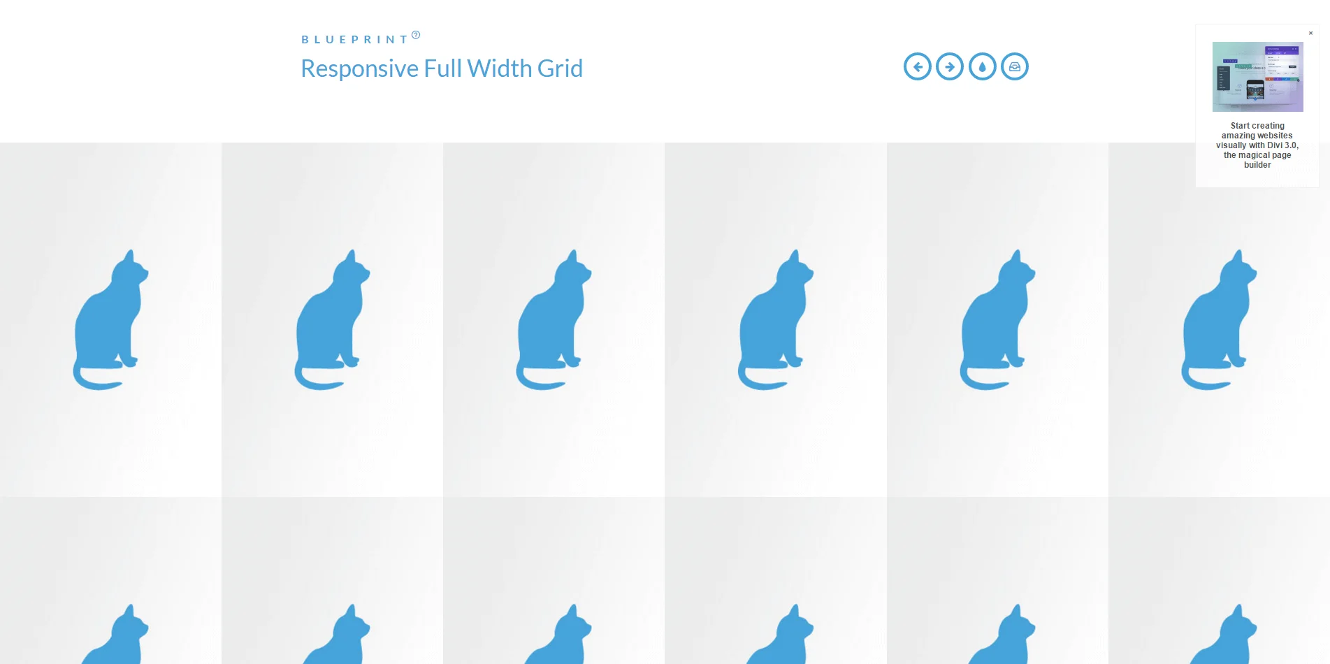
响应式格子布局-Responsive Full Width Grid 网页布局 资源 17年11月15日 编辑 叶少侠创作者先锋 取消关注 关注 私信 A layout for a full width flexible grid layout for images or other content. The items have a percentage width and some example media queries show how to adjust the items shown per row. 用于图像或其他内容的全宽度灵活网格布局的布局。这些图片有一个百分比宽度,一些示例媒体查询显示如何调整每行显示的项。查看演示 下载资源文章链接:https://www.sbkko.com/responsive-full-width-grid.html文章标题:响应式格子布局-Responsive Full Width Grid文章版权:SBKKO 所发布的内容,部分为原创文章,转载请注明来源,网络转载文章如有侵权请联系我们!相关文章:全屏图片幻灯-full width image slider背景幻灯片-Background Slideshow固定背景滚动布局-Fixed Background Scrolling Layout响应式多列表单-Responsive Multi-Column Form滚动动画标题-On-Scroll Animated Header谷歌瀑布流布局-Google Grid Gallery 给TA打赏 共{{data.count}}人人已打赏 web网站布局网页下载网页设计页面素材