
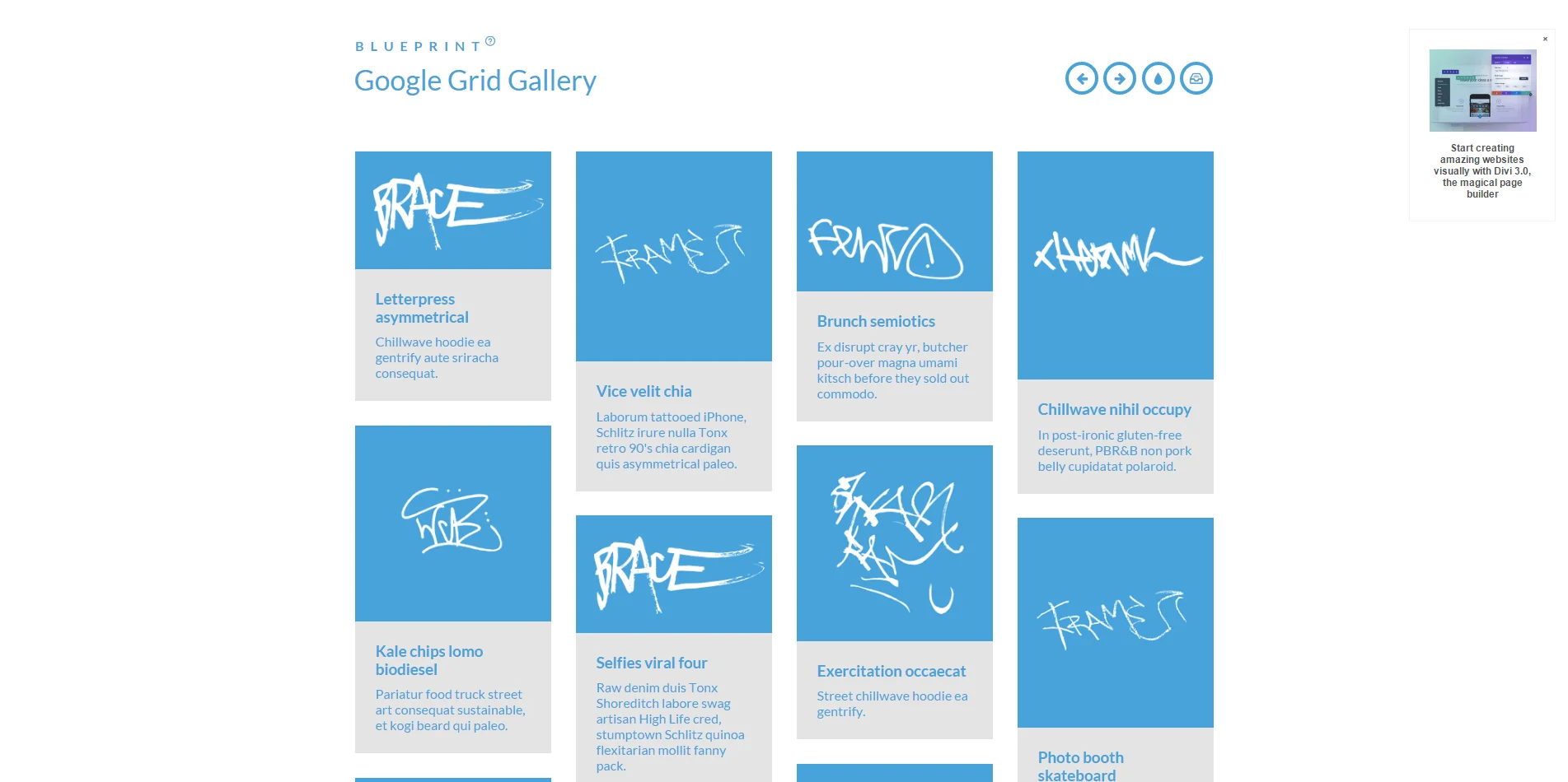
This Blueprint is a responsive grid gallery based on the gallery by Google for the Chromebook Getting Started guide. In this Blueprint we use Masonry for the grid and 3D transforms for navigating the items. For smaller screens we have some example media queries that adjust the grid layout and also the gallery view.
这是一个基于谷歌而获得Chromebook画廊响应布局,在这个布局中,我们使用了网格的砖石结构和用于导航项目的3D转换。对于较小的屏幕,我们可以调整网格布局和库视图。
谷歌瀑布流布局-Google Grid Gallery
人已打赏


“对方正在输入中”,给了多少人希望,又让多少人绝望。
窈窕淑女,君子好逑。
生活就像超级女生,走到最后的都是纯爷们。
水的清澈,并非因为它不含杂质,而是在于懂得沉淀。