
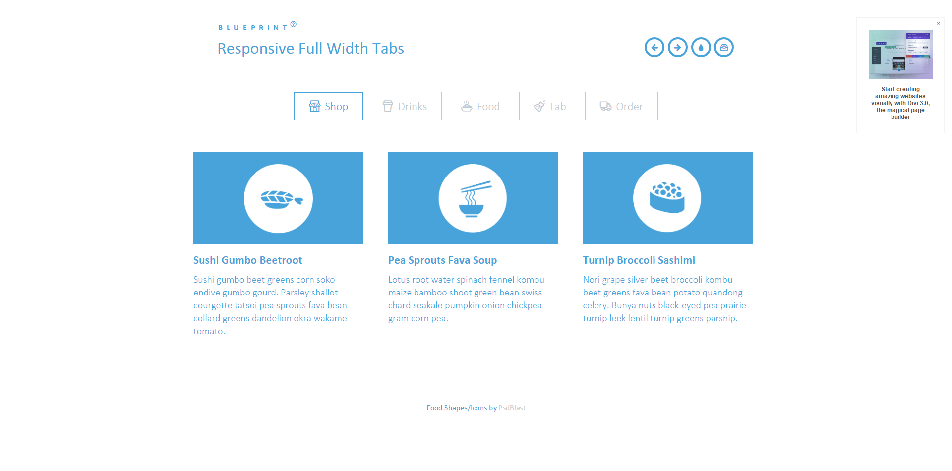
A full width tab component with some example media queries for adjusting the icons of the tabs and the content layout. The main idea is to show only icons for the mobile view and allow the text to appear when there’s enough space. The content columns and the containing media boxes have three different layouts.
一个全宽度选项卡组件,带有一些示例媒体查询,用于调整选项卡和内容布局的图标。其主要思想是只显示移动视图的图标,并允许文本出现时,有足够的空间,内容栏和包含的媒体框有三种不同的布局。
响应式全宽度选项卡-Responsive Full Width Tabs
人已打赏


可以,之前我用过
哪有顷刻之间的心灰意冷,有的,只是日积月累的看透罢了。